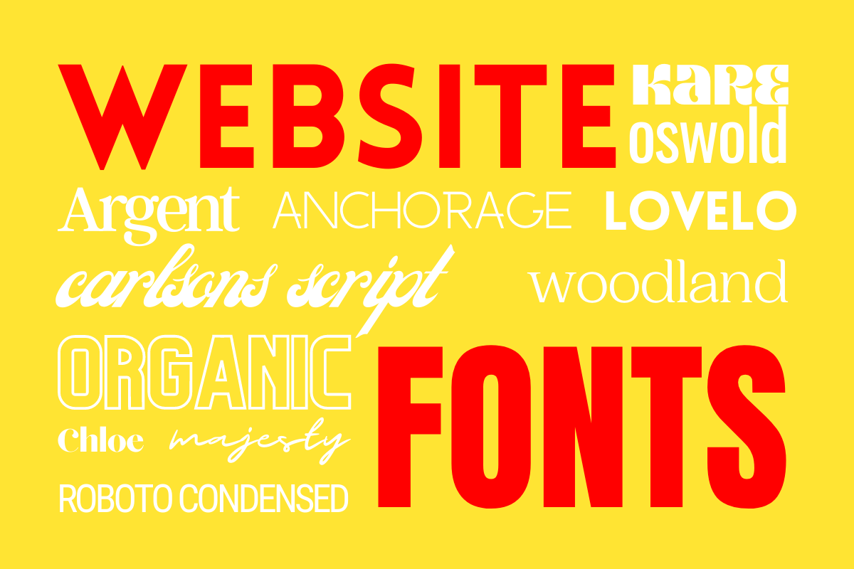
Website Fonts: 5 Top Tips on Choosing Great Combinations
Choosing website fonts can be daunting.
But the choice you make matters. The fonts you choose on your website need to reflect the style of product or service you are selling, as well as being clear and readable on any size screen.
Here are my 5 Top Tips on to choose the best combinations of website fonts.
1 Choose the same font family
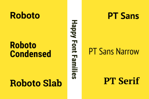
If you want to guarantee that different fonts you choose for your website match, choose two from the same family.
Roboto has three main styles, which all work together, and have a clean, contemporary feel.
PT Serif offers a great contrast to PT Sans, but, because the fonts have the same fundamental proportions, both still work together.
2 Combine a Serif font with a Sans Serif font
Serif fonts are designed for reading in volume – the serifs help encourage the eye to move along the line, a bit like joined up writing.
Sans Serifs fonts, which were first designed in the 19th century, are, as the name suggests, without the little serif lines. The clean looking fonts became key to modern design.
The classic choice for written content is Sans Serif font for headlines, which is combined with Serif font for body text.
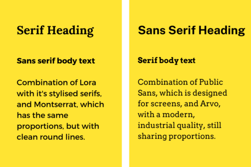
But why not mix it up? I really like using a Serif font for headlines and Sans Serif for body text, for an more modern style.
Font Pair is a great resource to see how different Serif and Sans Serif fonts work together.
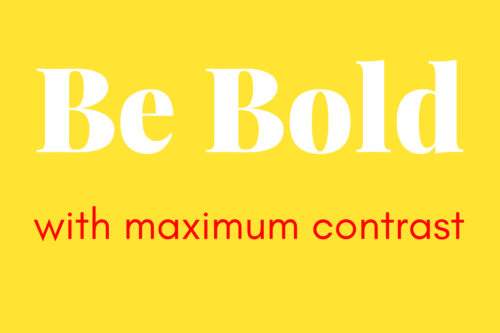
3 Choose website fonts with maximum contrast
Add real character to your website, and choose a loud bold display font for your main titles.
Display fonts are designed to be used sparsely, with just a few words, which means that these fonts are suited to Site Titles and Page Titles, rather than blocks of text.
For maximum impact, combine with a super-simple font for the main body text.
Use it as large as you dare!
4 Make use of free Font Combination tools
The web is full of typeface devotees who have made fabulous websites to share their love.
Scroll through and find some inspiration on choosing typefaces:
- Typotheque: extremely quick and easy to use – just drag and drop different fonts to see how they look.
- Typespiration: a huge range of examples, with filters to help you find what you need.
- Typewolf: a carefully curated selection – great if you don’t want too many choices.
- Google Fonts: hundreds of fonts, available for free, with popular combinations to test out.
All our Flat White websites come with the complete set of Google Fonts, so their tool is a great way to try out combinations and recommendations.
5 Find inspiration with other website fonts
Look at other websites for inspiration.
Have a good look for websites that use combination of fonts you like, then find out what fonts have been used.
Use the Inspect Element tool in Google Chrome. Firstly, right click on the website page, then highlight one or more words in the font you are interested in, and finally scroll down the right hand panel to find “font-family”.
Cabin Condensed is the font we use for both Headings and Body Text on our website.
Read more top tips for website branding in our guest blog by branding expert Vardeep Edwards.
Ready to take the next step on your journey to getting your website?
Find out all the options we offer – from a Landing Page website, which is the quickest way to get up and running, to a full multi page website with SEO analysis, Google Analytics, and full Stripe integration to sell goods and services.