Contrast ratio on your website: check it with this simple guide
A good contrast ratio is one of the key factors in making your website’s text easy to read.
But what exactly is a contrast ratio, and how do you check it? This guide will walk you through the basics, so you can ensure your website is both stylish and accessible.
What is a contrast ratio?
The contrast ratio is a measure of how much the text on your website stands out from the background it’s on. It’s all about the difference between the lightness of the text and the lightness of the background.
The higher the contrast, the easier it is for everyone to read, especially people with visual impairments.
There’s one But…
Too much contrast isn’t good either. Read my blog explaining why to avoid pure black and pure white and what to use instead.
Why does it matter?
If your contrast ratio is too low, your text can blend into the background, making it hard to read. This not only frustrates your visitors but also makes your site less accessible to people with vision problems. Plus, having a poor ratio means your website doesn’t comply with important accessibility standards, like the Web Content Accessibility Guidelines (WCAG).
How to check your contrast ratio
Don’t worry if this sounds a bit technical. Checking your website’s contrast ratio is easier than you might think. Here’s how you can do it:
1 Use an online contrast ratio tool
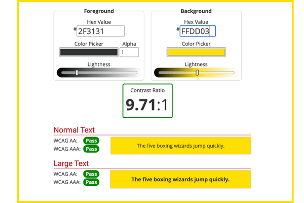
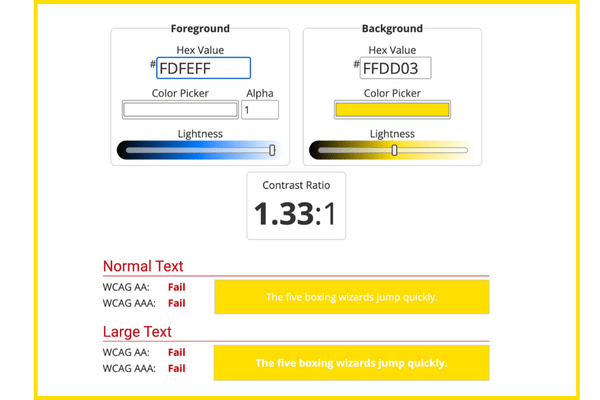
There are plenty of free online tools available. My favourite is the WebAIM Contrast Checker. You just need to paste in the hex codes (those are the colour codes like #FFFFFF for white) for your text and background colours, and the tool will tell you if your contrast ratio meets accessibility standards.
You can see the results of testing our Flat White Websites website with the WebAIM tool:
2 Browser extensions
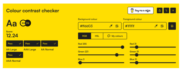
Color Contrast Checker is the Chrome Extension I’d recommend. It’s super convenient to check your contrast without needing to know the exact colour codes. Once you install the extension, open your web page, click on the extension icon, and it will automatically read your colours and give you a score.
Again, you can see the result when I checked our website:
What ratio should you aim for?
According to WCAG guidelines, the minimum contrast ratio for normal text should be 4.5:1. For larger text, like headings, a ratio of 3:1 is usually acceptable.
These ratios ensure that most people, including those with some visual impairments, can read your content comfortably.
Final thoughts
Checking and adjusting your website’s contrast ratio is a simple yet powerful step toward making your site more accessible and user-friendly. By ensuring your text stands out clearly from the background, you’re not only improving readability but also showing your commitment to inclusivity.
We share share simple tips like these to improve your website in our regular Website Wisdom – sign up to get your website working brilliantly for you and your visitors: